The Block 2019: Elise & Matt's Bathroom Reveals
Week 12: Media Room and Hallway Week
This week on The Block was the most challenging one yet. Elise and Matt left their rooms in a barely finished state, as they’d committed to creating a home office, the hallway, and a full powder room.
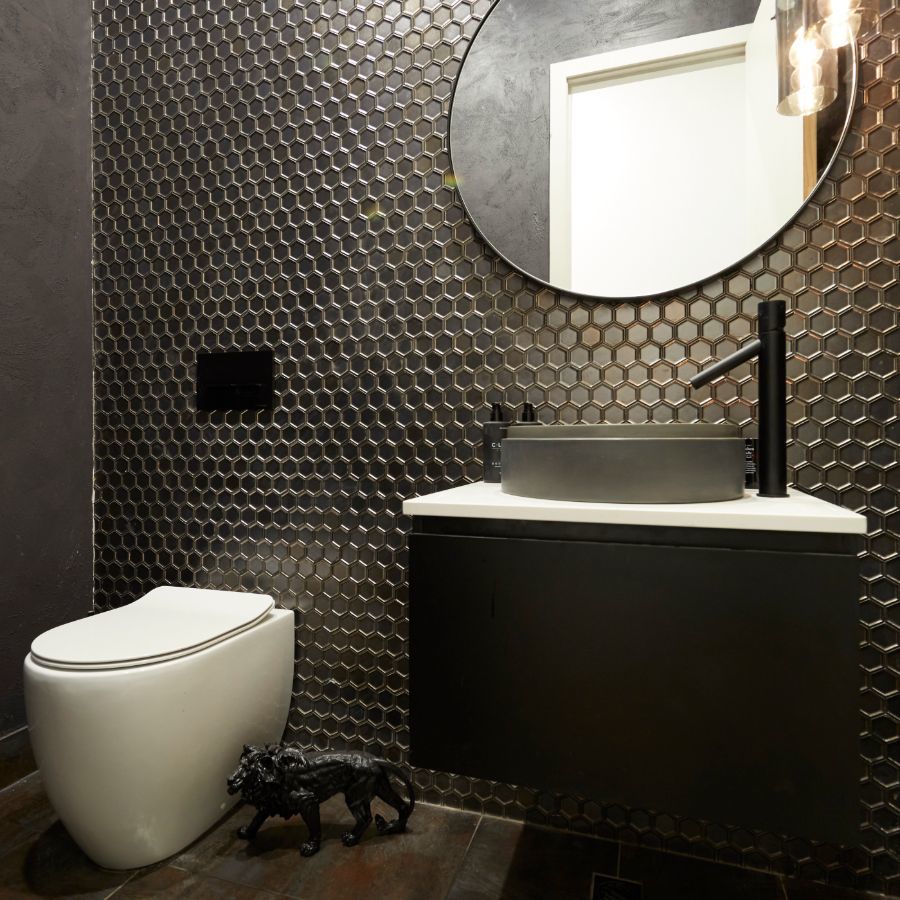
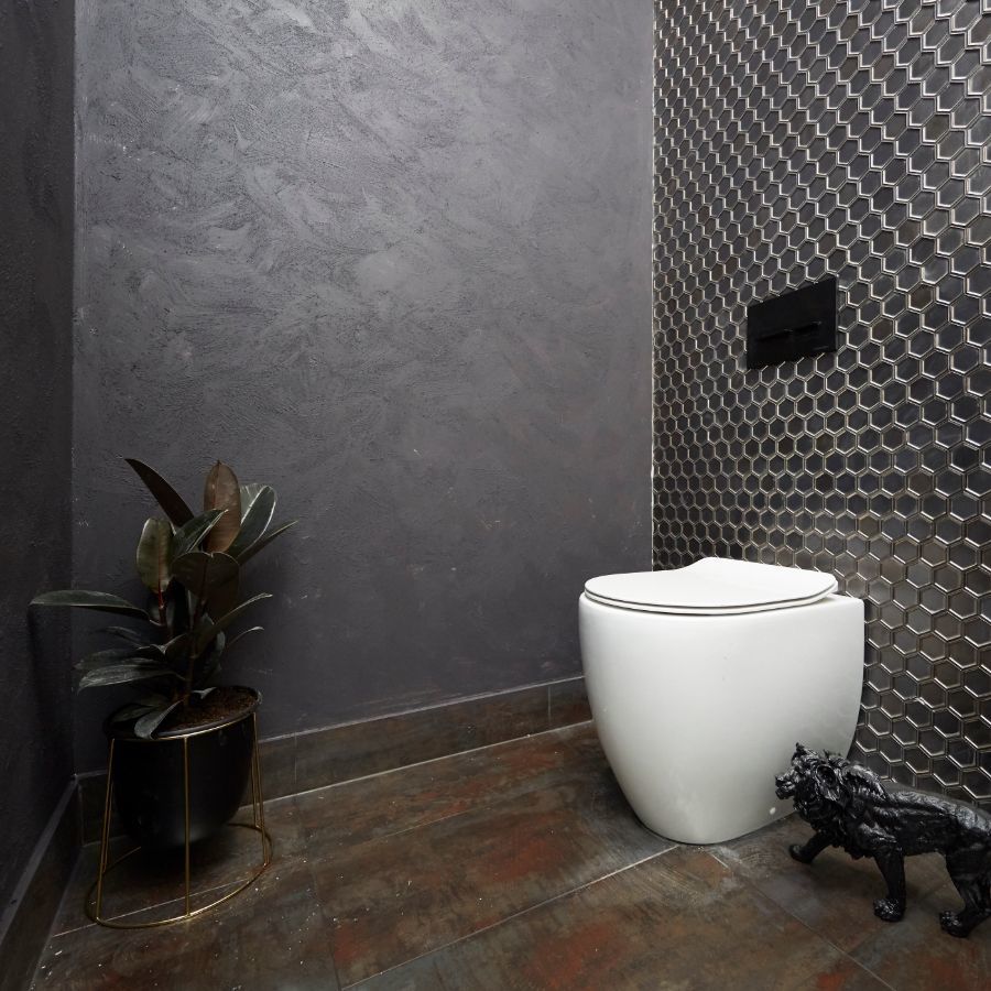
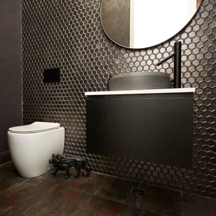
The judges were sympathetic to the task, acknowledging the mountain of work that all the contestants had to complete this week. They were disappointed that the staircase was still unfinished. However, they were fans of the powder room — Darren loved the sink and the mirror, and Neale was a fan of the metallic tile choice.
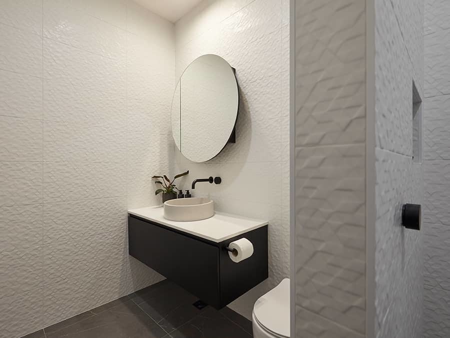
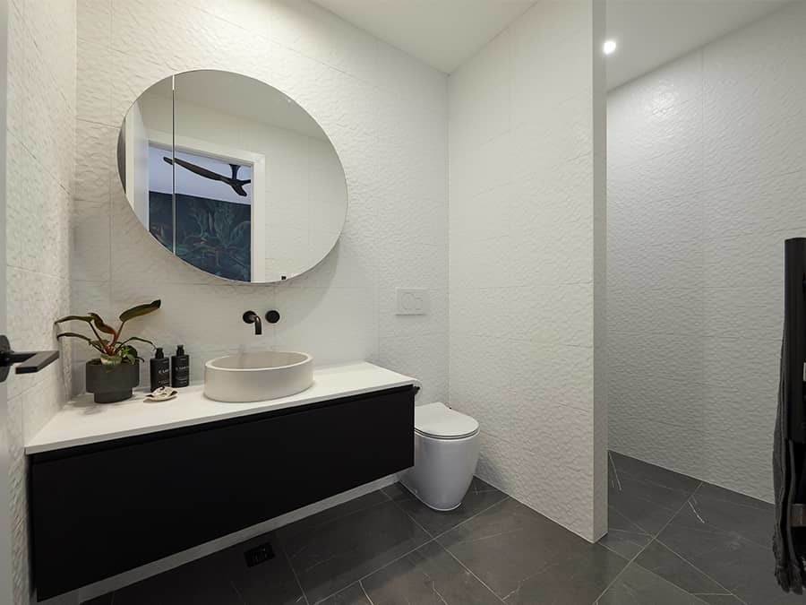
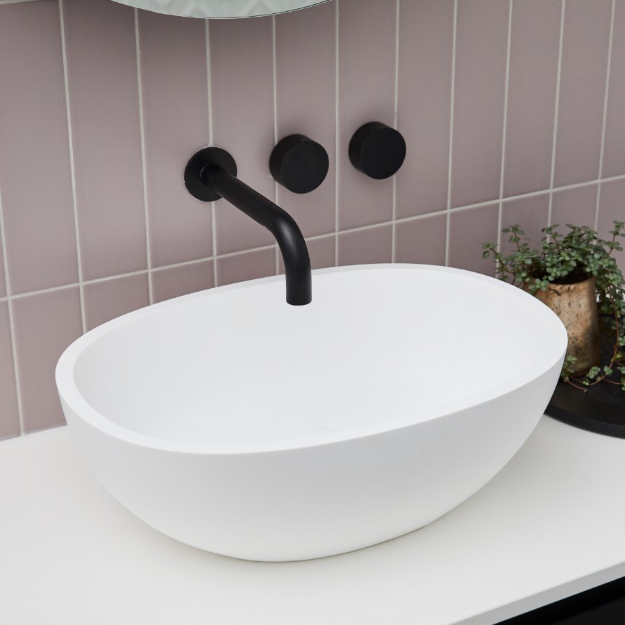
The most finished part of Elise and Matt’s house this week, this powder room is moody and contemporary. The back to wall toilet pan pops out from the metallic honeycomb tiles behind, and the matte black of the vanity opens up the space. The extended basin mixer contrasts with the white top of the vanity to create interest and intrigue.
Featured Products:
Week 10: Studio Week
As Elise put it, “this week, with no money and little time, has been a painful week.” Despite their hard work, their progress was stopped by a massive downpour that leaked into their studio ensuite. This meant their waterproofing had to come down, which was a massive setback in what was already a tight timeline. Luckily, they took in their stride and were able to (almost) complete their rooms, aside from running out of time to install ventilation in the ensuite.
While the judges were impressed with the couple’s product choices and the spacious feel of the bathroom, they weren’t blown away by the overall aesthetic. Neale revealed that while it ticked all the boxes, it was not exciting and was slightly generic. Shaynna was concerned the lack of natural light would induce a claustrophobic feeling, but she did love the choice of floor tiles, wall tiles and products.
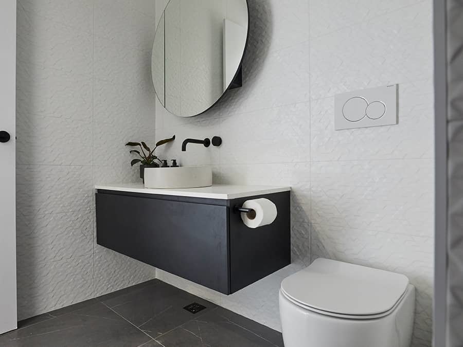
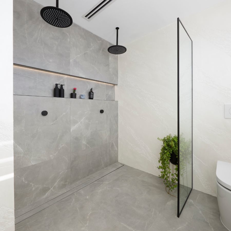
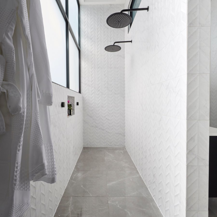
Elise and Matt have gone with textured white wall tiles and large grey floor tiles to make their space feel bigger. Their circular basin pairs perfectly with their round mirror and curved toilet in a cohesive look that produces a calming effect. It’s practical and stylish, with a wall separating the shower for privacy and a sleek vanity with ample storage.
Featured Products
Week 6: Master Ensuites
A week of ups and downs for Elise & Matt as Elise felt like they’d had their bedroom reveal success snatched out from under them. They had further dramas when they chose to use Venetian plaster on the master ensuite’s walls.
However, the choice paid off. The judges loved the walls and the tactility they added to the room. The styling also impressed, particularly the luxurious quartz tray on the vanity. However, Shaynna questioned the couple’s choice of bath. Darren felt that while the room was the most exciting ensuite aesthetically, that had come at the cost of compromising the functionality of the space.
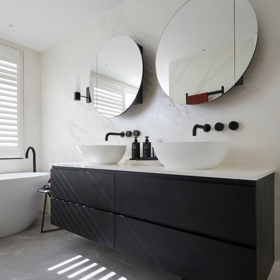
Beautifully textured, brushed concrete walls set the tone for Elise and Matt’s lush master ensuite. The dark wood of the wall hung vanity complements the matte black fixtures and provides contrast to the white benchtop and dual above counter basins. The circular shape of the mirrors is echoed by the two overhead showers and their accompanying taps. The wall hung toilet and concealed cistern don’t detract from the unique textures of the wall.
Featured Products
Week 4: Main Bathrooms
Taking a page from Mitch & Mark’s book, Elise & Matt decided to mix their floorplan up this week and used the HiPages lever to make it happen. The judges loved the lush textures and the colour scheme of the tiles, as well as the pared back styling. Darren had some issues with the task lighting in the vanity, but the positive reaction to the shower space more than made up for it.
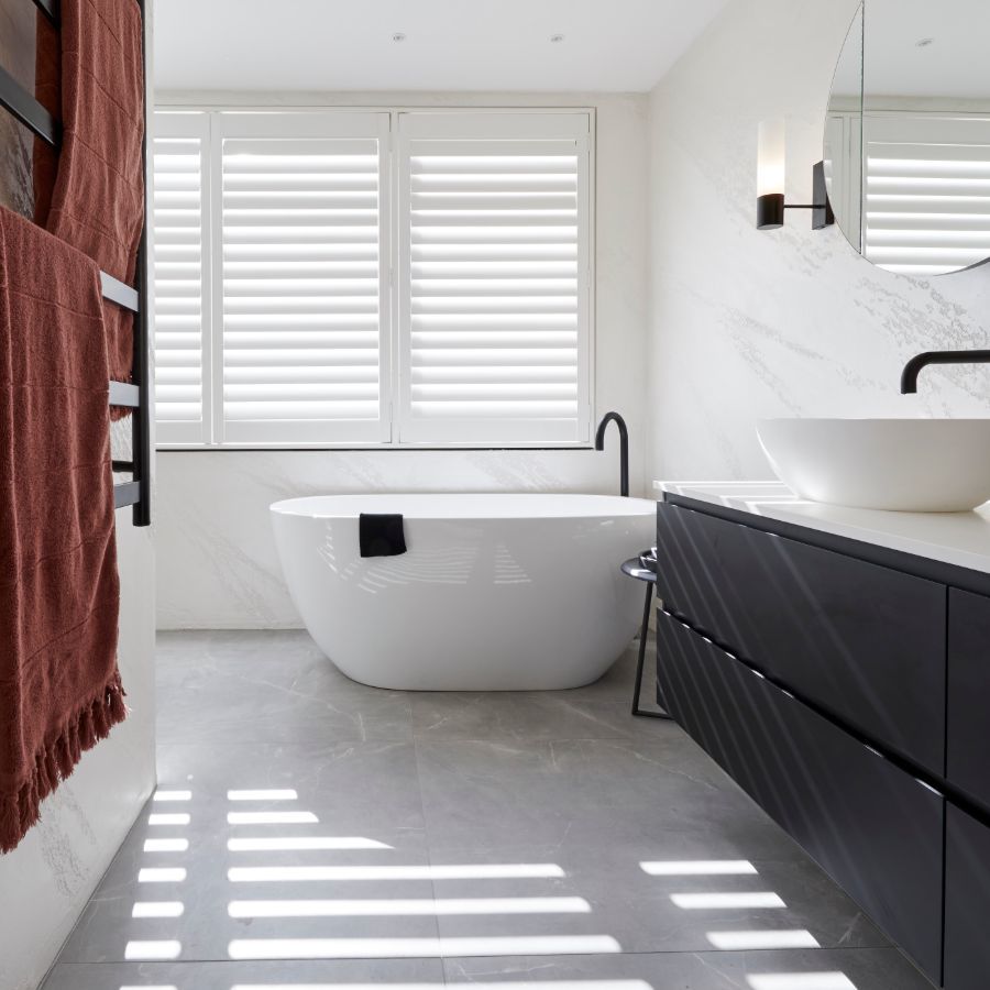
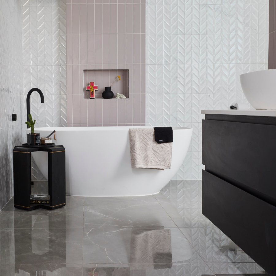
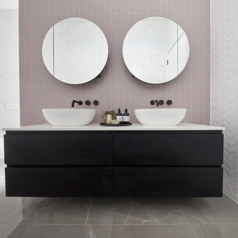
Elise & Matt’s main bathroom feels hotel inspired. The two vessel basins bring their sleek curves that stand out from the vertical tiles behind. The polished marble floor makes the freestanding bath seem to appear out of the ground. The floor outlet in matte black only adds to the effect, elegantly curving out over the bath. The matte black finish brings consistency to the room, matching the heated towel rail and the bath taps. This is one luxurious main bathroom.
Featured Products
Week 1: Guest Ensuites
Elise and Matt's guest bedroom was well-executed, with the right period touches and beautiful details. However, they ran out of time to complete the room which the judges found extremely disappointing.
With some clashing design choices in their guest ensuite, the judging team found that there was a lot to like, like the black pendant light. Ultimately, though, they felt Elise & Matt had lost focus with this one.
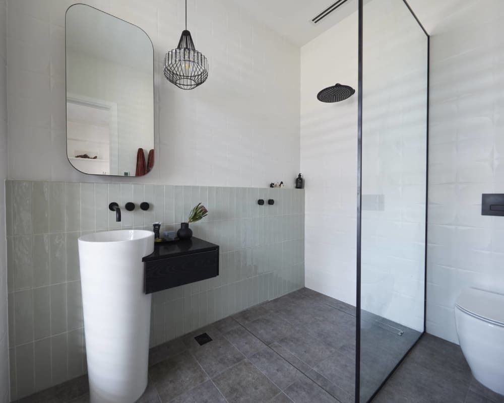
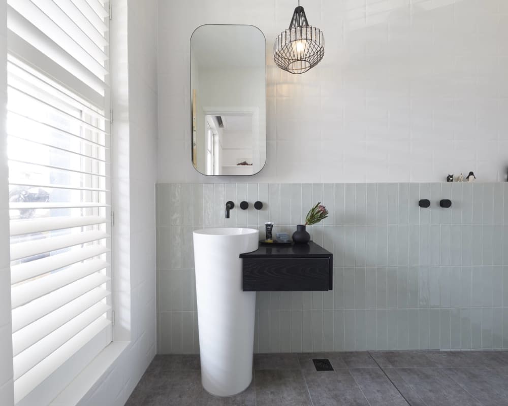
Elise & Matt make efficient use of space with their guest ensuite. The unique washstand pairs a small footprint with a sophisticated design, while the accompanying storage shelf adds contrast. The curved mirrored cabinet brings not only an elegant touch but also well-concealed storage.
Smart design decisions continue with the back to wall pan, concealing the cistern and increasing the feeling of space. Stylish matte black fittings create contrast in the walls.
Featured Products
