The Block 2019: Tess & Luke's Bathroom Reveals
Week 12: Media Room and Hallway Week
This week on The Block was the most challenging one yet. Tess and Luke struggled to get things complete on time, and even when the time came for tools down, there were walls left unpainted and skirting board left unapplied.
The judges, however, were impressed with how much the house had changed in just one week.
The skylight that cuts through Tess and Luke’s entire home, bisecting the media room, was a hit. Neale was impressed with the restrained styling, saying that you can see how the duo put themselves into the minds of the buyer.
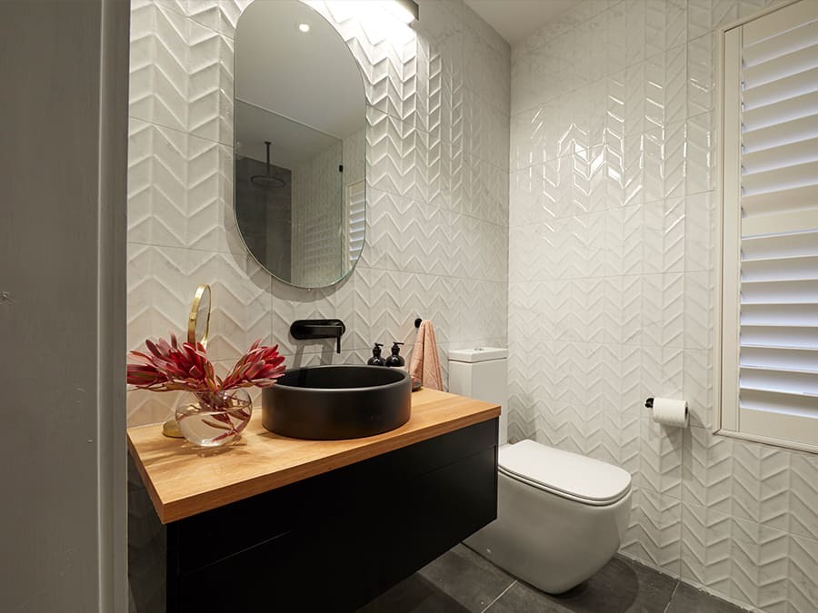
Despite being rough around the edges, Tess and Luke’s powder room still achieves a coherent look and shows off how to create a spacious feeling with a small floor plan. The wall hung vanity opens up the space, and the perfect circle of the rounded mirror complements the basin below. Grey tiles enhance the striking effect of the vanity.
Featured Products:
Week 10: Studio Week
It was make or break for Tess and Luke in studio week, with only enough money left in their budget to finish this week. In a final bid to win more money to be able to complete the project, they were the only couple to create a self-contained studio apartment. They not only made it to the finish line, but they nailed it, winning this week’s competition and $10k to go towards the rest of the house.
The judges were impressed with Tess and Luke’s well thought out space, and the way they delivered to their target market of multi-generational buyers. Shaynna was happy with their ample vanity storage, while Darren was impressed with the size of the shower. While Shaynna wanted to see more continuity, Neale felt there was a sense of cohesion, with black tapware in the kitchenette and black fixtures in the bathroom.
Tess and Luke have managed to fit a lot of function into a small space. The sleek vanity with abundant storage, an overhead shower, a toilet and the added indulgence of a heated towel rail make this ensuite a practical and stylish space. The lighting over the mirror is perfect for the morning and night routines, and the textured wall tiles make the ensuite feel inviting.
Featured Products
Week 6: Master Ensuites
Tess & Luke spent a large amount of time planning their master ensuite, and they chose to pulled the lever in order to catch up to the other teams. Stress came at the last minute as their glazier left them unable to frost the window in their ensuite.
While the judges were also concerned by the shower’s clear, unfrosted window, they loved the ensuite overall. Neale thought that they’d use the terrazzo effectively and loved the shower tile choice as well. However, the judges were split on the feature wall. Shaynna loved the dramatic black that connected with the finish of the basins, but Neale and Darren thought it closed off the space.
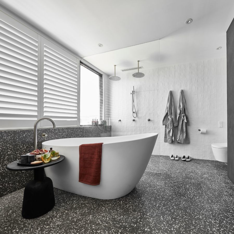
Tess & Luke’s master ensuite demonstrates the power of terrazzo—these tiles simultaneously complement all the different shades in the room. The freestanding bath has an immediate impact. The angles of the wall hung vanity balance the curves of the basins and the mirrors. Behind the separating glass, two overhead showers will recreate a drenching overhead downpour, while the hand shower keeps the space functional and flexible. Brushed nickel finishes through the room are softer and more modern than chrome.
Featured Products
Week 4: Main Bathrooms
Tess & Luke grabbed the crown this week with a main bathroom that does everything right. From beginning to end, the judges were full of compliments. Darren said it was literally one of the best bathrooms ever on The Block. The judges also loved that there was plenty of storage and excellent styling, which had been a challenge for the couple. An impressive result.
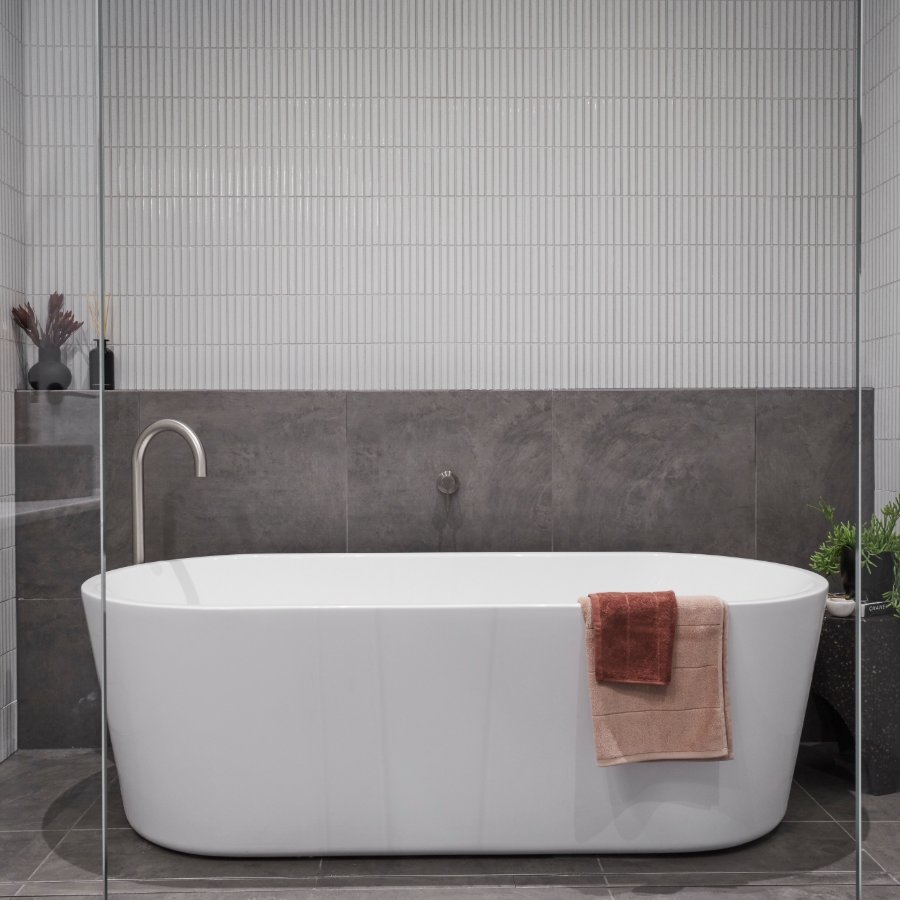
Tess & Luke’s main bathroom is stunning. The combined wet zone is a great way of saving space. Two overhead and matching rail showers mean the room feels both indulgent and functional. The freestanding bath provides a space for a more relaxing soak but can also cater to families with young children. The black finish of the vanity adds a modern edge, complemented by the mirrors above. Finally, the brushed nickel fixtures bridge the wet and dry zones to bring the room together.
Featured Products
Week 1: Guest Ensuites
Tess and Luke were under intense pressure to get their guest ensuite over the finish line. It didn't help that they'd created a huge footprint for the space, which Scott was keen to point out.
Luckily, they were able to complete the room this time. While the judges loved the patterned tiles here, they weren't full of praise. They called the style undercooked and questioned their budget priorities.
Tess & Luke’s guest ensuite is a celebration of the neo classic trend. The traditional-style wall hung vanity is topped by two modern bi-colour counter basins. The mirrored cabinet provides further storage solutions.
All bathing preferences are covered with the freestanding bath and the short twin shower. Matte black accessories continue the modern feel, while little touches like the heated towel rail elevate the space.
Featured Products


