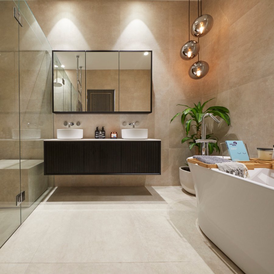
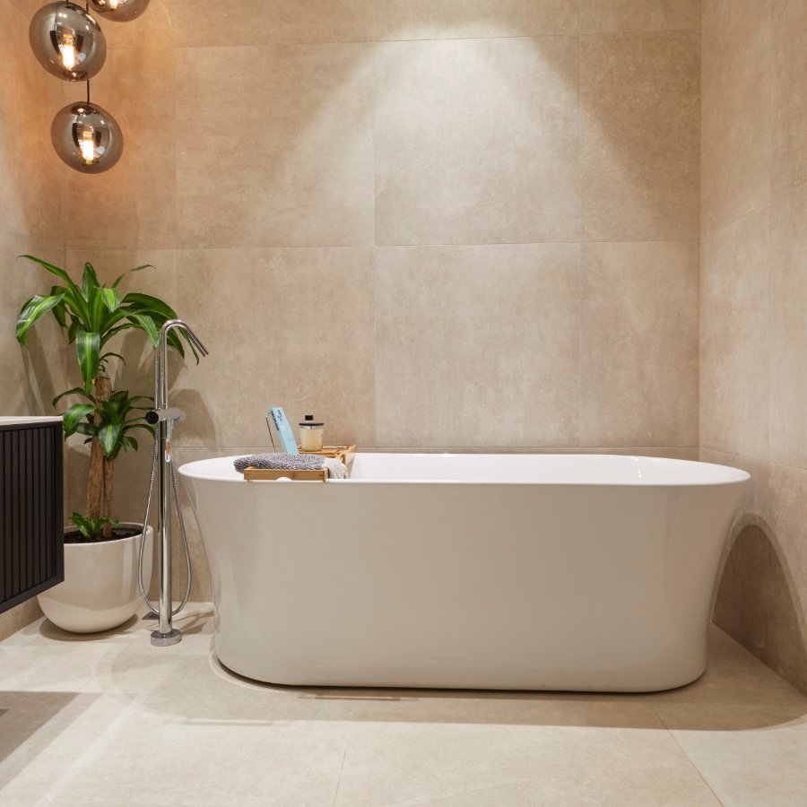
The Block: Family Bathroom Recap - Alisa & Lysandra
A bathroom’s layout is the most essential factor in a winning Block bathroom. If done well, the functionality and aesthetics of one of the hardest working rooms in the home should come together seamlessly. This week The Block contestants delivered some incredible main bathrooms, and to be perfectly honest, there wasn’t much we didn’t love!
Tess & Luke
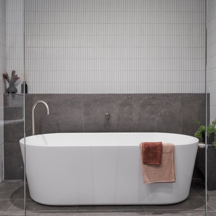
Things we liked: This bathroom really impressed us with it’s sense of luxury, careful layout and refined colour palette. We thought the finger tiles were really on trend and not something we have seen too much of. The Brushed Nickel colour story throughout in the Mizu range looked absolutely stunning, particularly in the shower. Overall this was a really contemporary look that will appeal to buyers who enjoy the finer things in life.
What we would do differently: We would have swapped out the concrete basins for a lighter option as we feel the dark colour competes with the floor tiles too a little too much in this space. Other than that there is nothing to fault. Brilliant!
El'ise & Matt
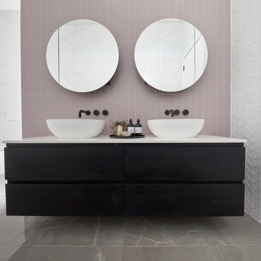
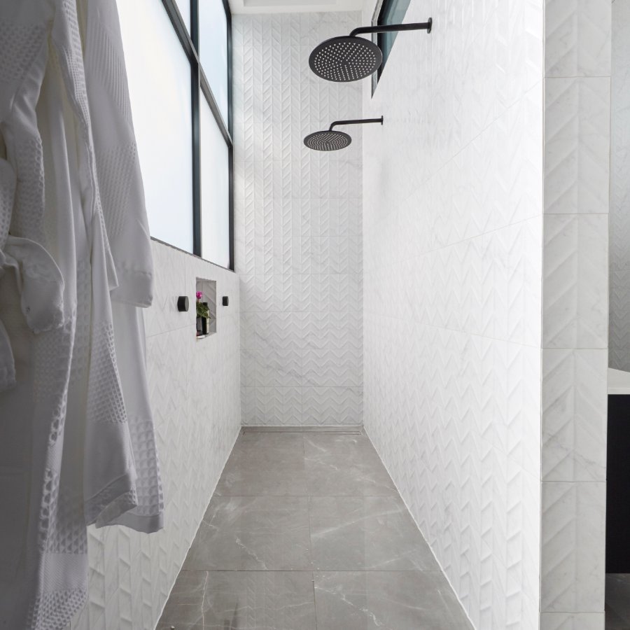
Things we liked: We loved the Posh Domaine double vanity with the twin round mirrors and the choice of the classic Kado Lussi Vessel Basin. It ticks all the boxes for design and functionality and makes a great impact upon entering the room. We thought the double shower design was really interesting and a unique way to include all the essentials they wanted whilst accommodating the large windows.
What we would do differently: There was just a bit too much going on in this space and the eye just doesn’t know where it is supposed to be drawn with so many feature tiles and non-essential inclusions like the pendant. We would have stuck with a maximum of two feature tiles and removed the feature pendant all together as there are certainly enough hero pieces without it.
Andy & Deb
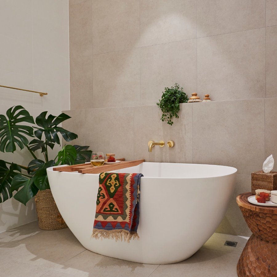
Things we liked: We loved the use of texture and tone to create a really calming colour palette and thought that this couple’s layout was spot on. It is certainly a bathroom where you want to take a nice long dip and soak up the ambiance thanks to their Kado Lussi freestanding bath.
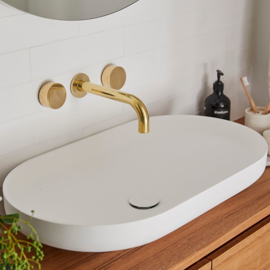
What we would do differently: There was a little too much styling. The beautiful Milli Pure Living Tumbled Brass taps and their choice of Omvivo Venice basin don’t quite get the moment they deserve in among all the accessories on the vanity.
Mitch & Mark
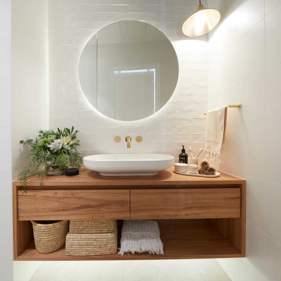
Things we liked: Once again, this team used a great combination of natural elements and texture to create interest in their bathroom, whilst still keeping it light and bright. We loved all their choices of fittings, particularly the combination of the Acqua Vanity in American Walnut and Mizu Drift Brushed Gold taps.
What we would do differently: We really loved this space but thought a plain white tile as opposed to the gloss marble would have worked better with their stunning choice of floor tile and feature wall tile. As the saying goes, sometimes less is more.
Jesse & Mel
Things we liked: The Issy Halo vanity and shaving cabinet were a great choice for this bathroom (who can go past a classic black and white combo)? There was ample storage, which is essentially what every main bathroom should have, and stunning double basins.
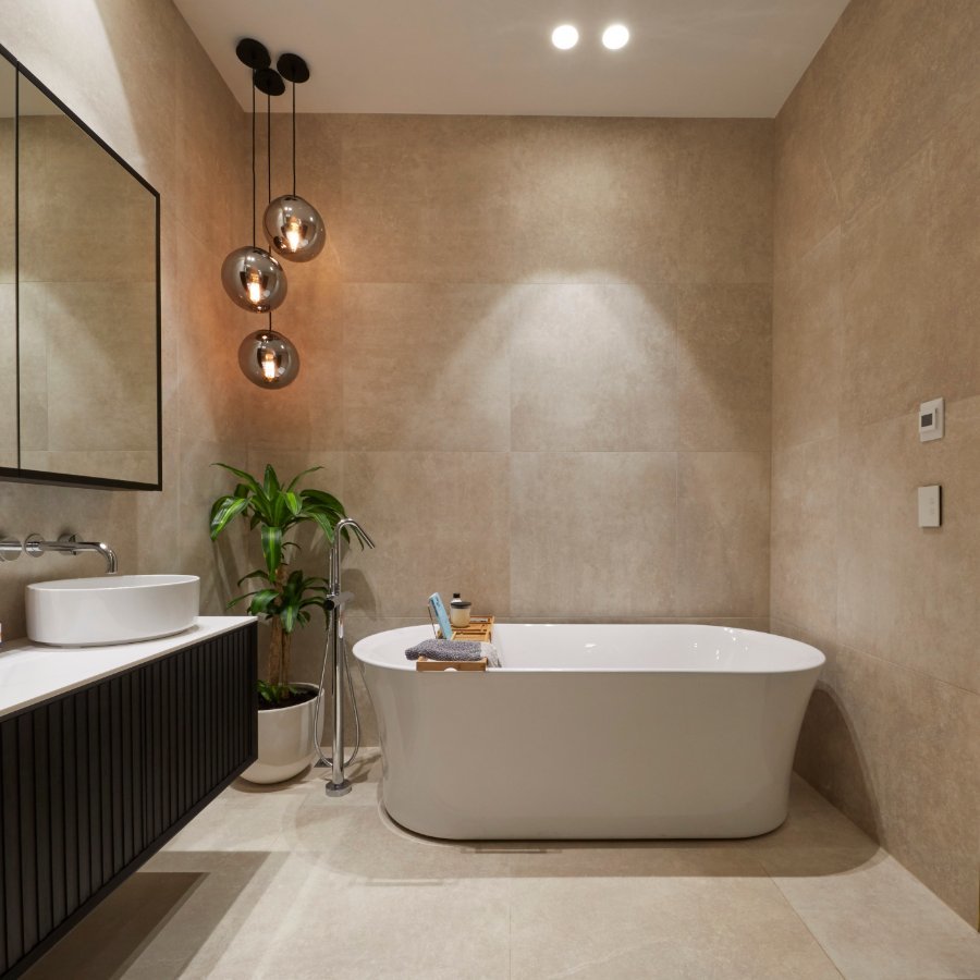
What we would do differently: This was our least favourite of the bathrooms this week. The selection of finishes combined with the unnecessary pendant lights created quite a dated look. Our biggest change of all would definitely be to get rid of the shower bench seat and choose a more contemporary wall tile.
Alisa and Lysandra xx


