The Block: Master Ensuite Recap - Alisa & Lysandra
Master Ensuite week is a chance for the contestants to show off their design chops, with a couple of bathrooms already under their belts. The stakes are high in what is arguably the most important bathroom on the floorplan, and the bar has been raised with some stellar designs in Guest Bathroom Week. Some of the contestants really rose to the occasion, delivering Master Ensuites that will certainly give them an edge come auction day. For others, the all-important layout of the room left a lot to be desired.
Mitch & Mark
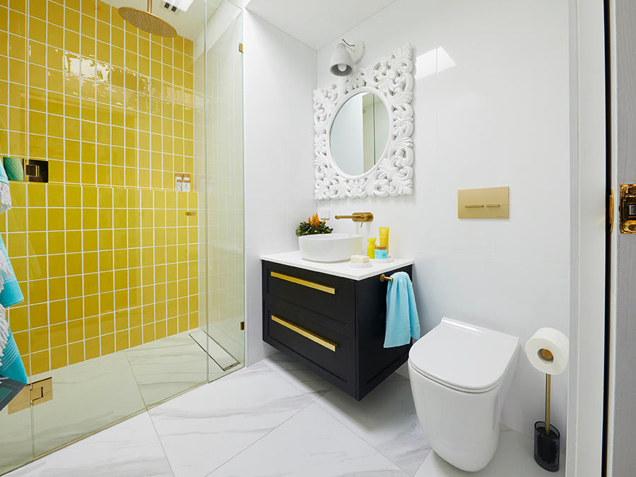
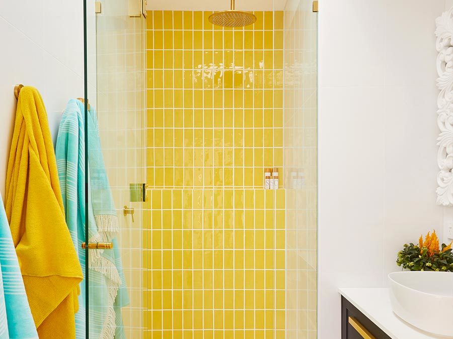
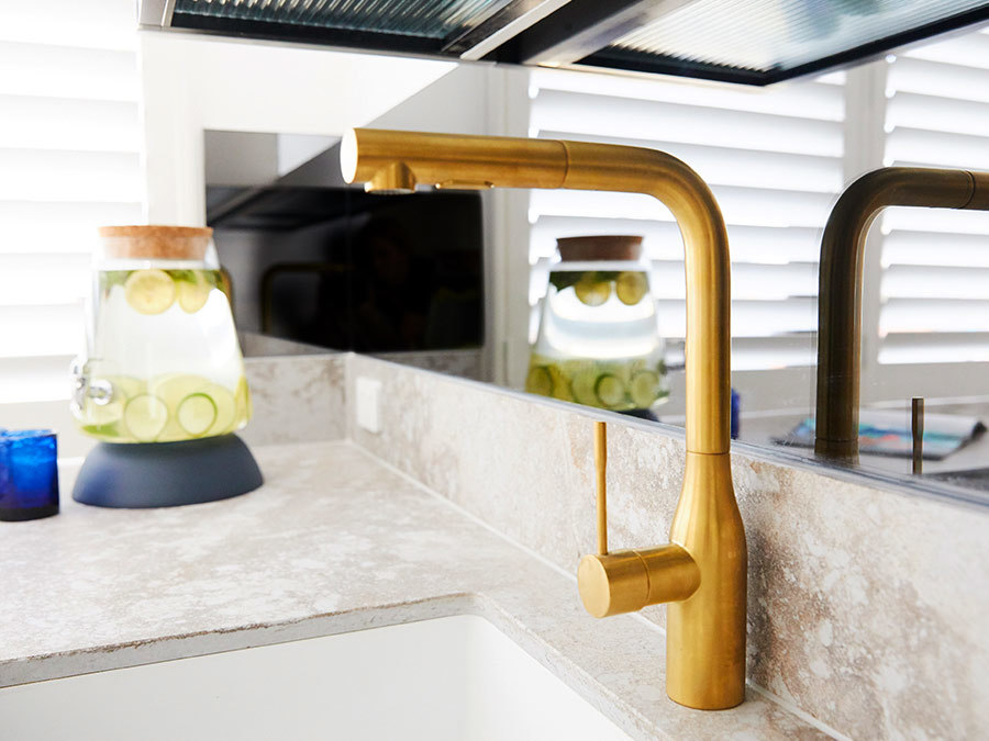
Things we liked: The kitchenette was a masterstroke, creating endless opportunities for their property with an essentially self-contained third floor. This point of difference could be highly influential come auction day. Their Kado Lux Vanity was a fantastic choice for this bright and bold space, breaking up the white tiles and providing a beautiful contrast to the mustard yellow feature wall.
What we would do differently: The selection of the yellow tile works with their selections to date but is a polarising colour. Some interested buyers will love it, whilst others will loathe it.
Jesse & Mel
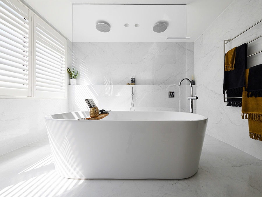
Things we liked: This is one couple that really got the layout right and maximised the space that they had. This ensuite felt grand with no awkward half turns to manoeuvre around. The generous proportions of the Kado Lux Drawer Vanity and the generously sized Posh Solus Freestanding Bath feel luxurious, whilst the tile selection emphasises the spaciousness of the room.
What we would do differently: The lighting needed a little more consideration to make sure the room is user-friendly, particularly around the vanity. The downlights aren’t positioned in the right place which is essential for a Master Ensuite where most personal grooming takes place.
Andy & Deb
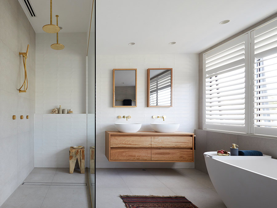
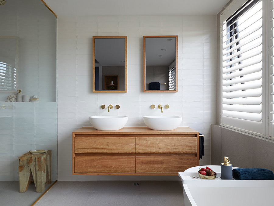
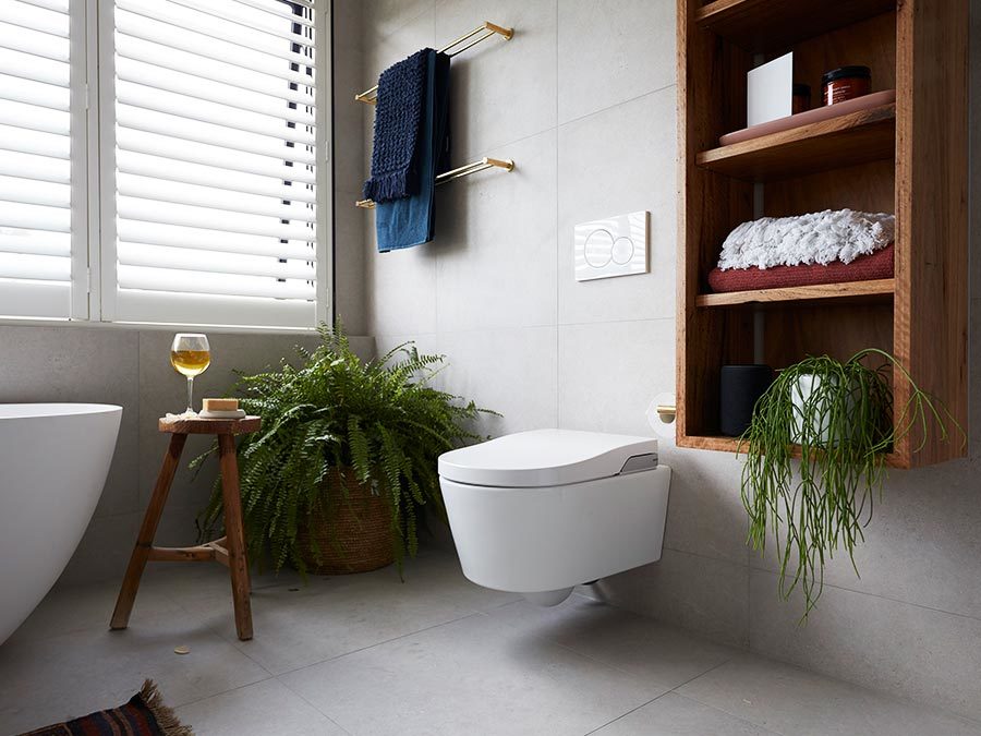
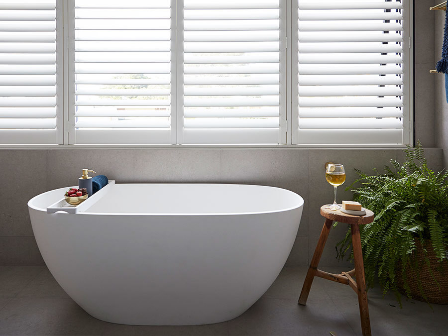
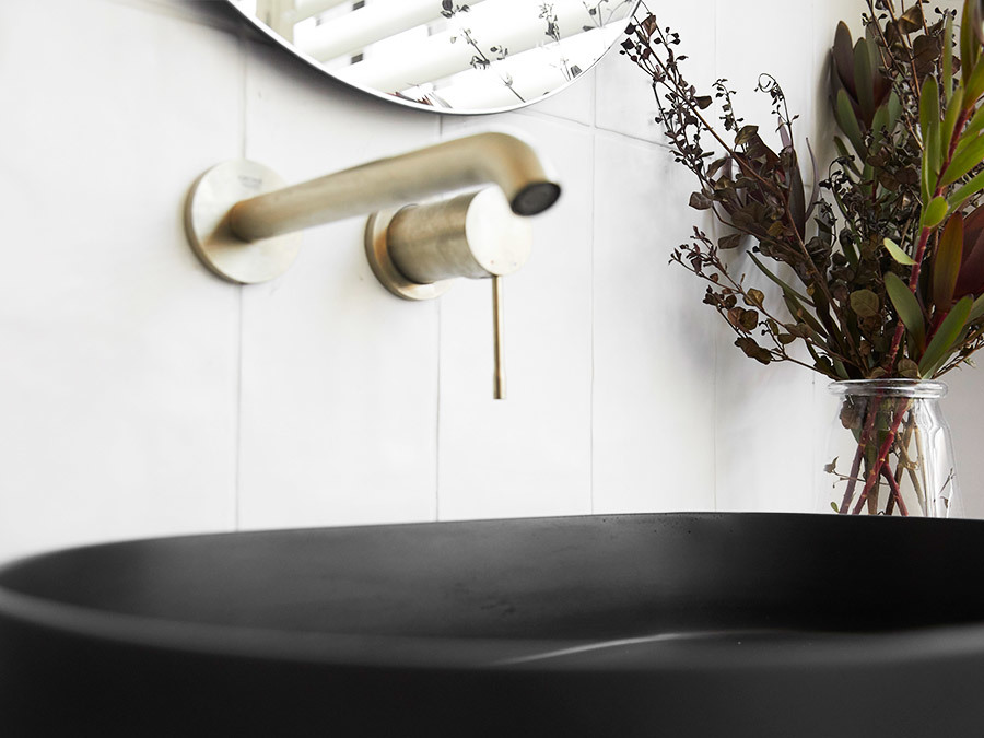
Things we liked: Styling was perfection as per usual for this consistent couple. The luxe look of the Milli Living Tumbled Brass taps and fixtures worked beautifully with the pared back tile selections and textures in the wooden vanity. The colour palette was stunning and will certainly appeal to a broad range of buyers come auction day.
What we would do differently: For such a spacious bathroom, the layout didn’t optimise the generosity of the room’s proportions. The size of the room is large, but regardless, careful planning is still required in any space to maximise the flow of the room.
Tess & Luke
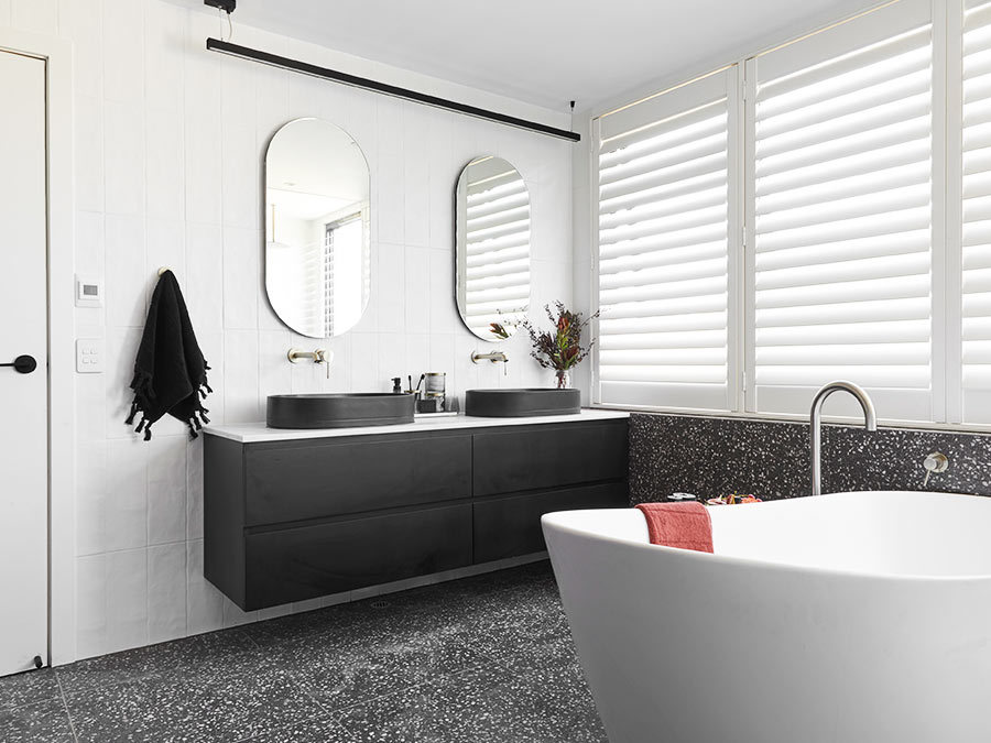
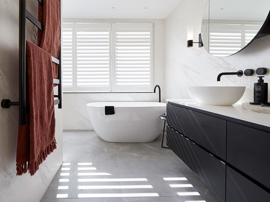
Things we liked: We love the basins and how they work seamlessly with the Posh Domaine Vanity and elegant oval mirrors. This bathroom pays homage to their guest bathroom and we like that continuity is playing a role in their design and planning.
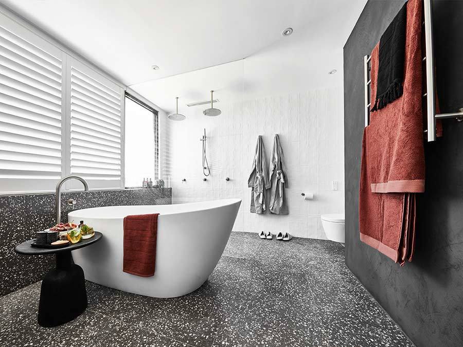
What we would do differently? We would have opted to continue the wall tile under the window rather than continue with the floor tile. The terrazzo look is quite dark when extending beyond the floor, and with the grey basins, black wall, dark vanity and burgundy towels for styling, the ensuite feels too dark.
El'ise & Matt
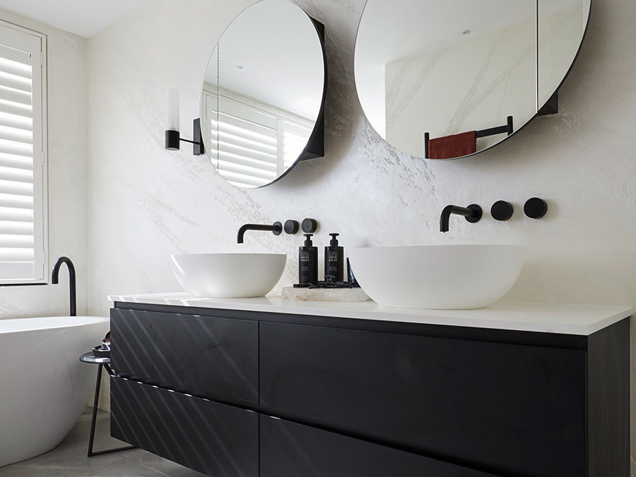
Things we liked: The finish on the walls was soft and textural with their use of Venetian plaster and created a restful vibe in a room where relaxation is a priority. The double mirrors really brought some wow-factor to this classic black and white bathroom.
What we would do differently: Once again the layout of this bathroom didn’t really work for us. The space felt quite small and unbalanced. Some smaller or slimline selections could have helped with creating a sense of space.
Alisa and Lysandra xx
