Three Birds Renovations Create a Glowing Hamptons Ensuite
The team from Three Birds Renovations - Lana, Bonnie, and Erin – create a Hamptons-style master suite for House 11.
The master suite in House 11 is designed as a parents' retreat for Amy and Reyhan, giving them a space of their own away from the hustle and bustle of family life. Lana wanted to create “something really special they want to escape to”, however, the renovation this week was almost purely cosmetic, so the pressure was on for Bonnie to work her interior design magic.
While the original master suite was liveable, it didn’t scream ‘sanctuary’. The master ensuite felt small and cramped with dated fittings and fixtures. In the final reveal of the episode, we see the space transform into a light and bright haven for relaxation.
Watch the full episode here:
Three Birds Renovations returned to their roots this week, with a purely cosmetic renovation that nevertheless transformed the entire feel of the rooms. Erin identified the most important thing to think about when planning the master suite — “think about how you’re going to live and move around the space.” This is somewhere that Amy and Reyhan will wake up every morning, so it was essential to think about function as well as aesthetics.
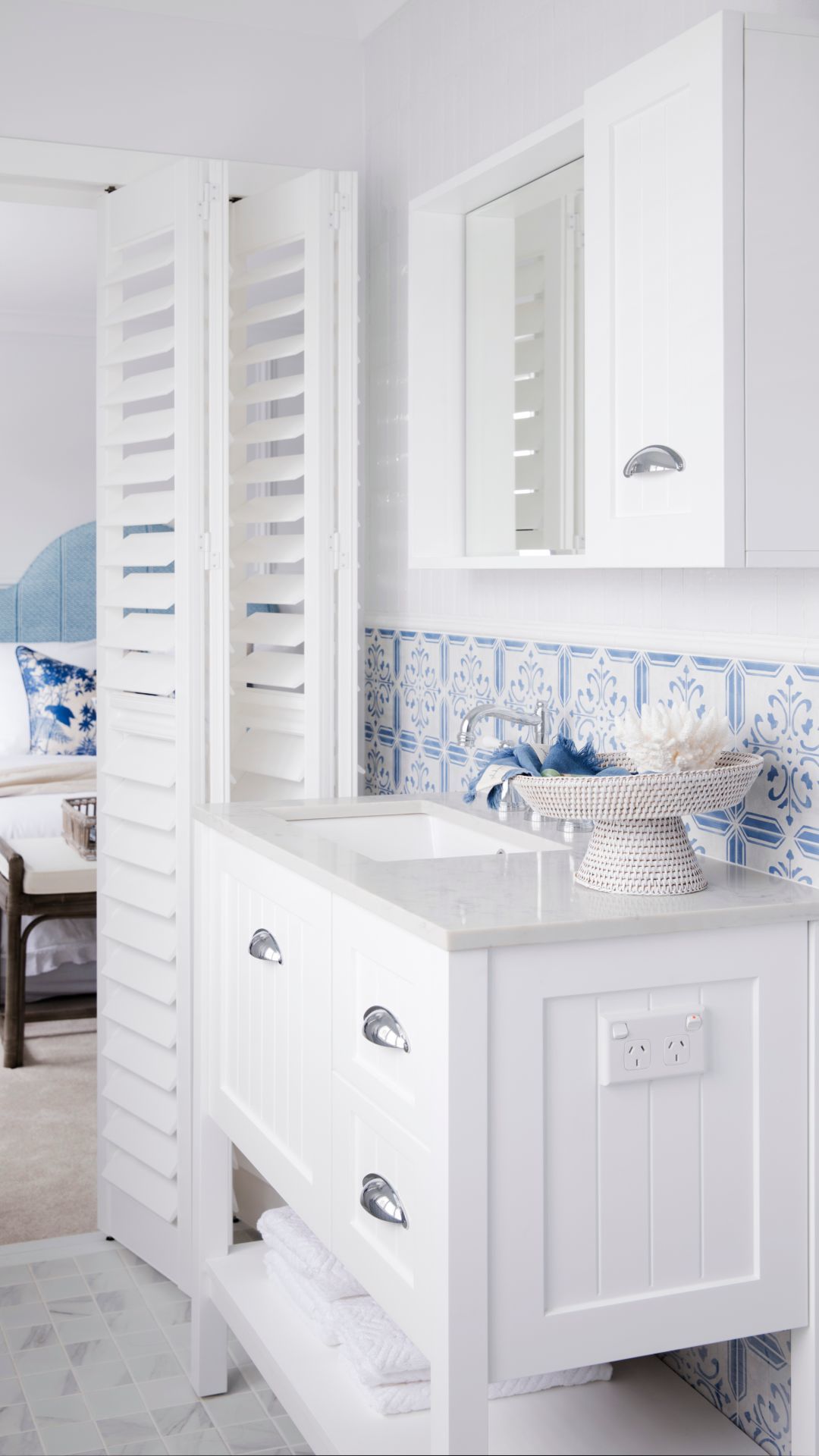
While the team weren’t making any major structural changes to the bedroom, they increased the feeling of space by opening up the doorways to the walk-in robe and ensuite. Bonnie jumped on the opportunity to add shutters to provide the true Hamptons feel.
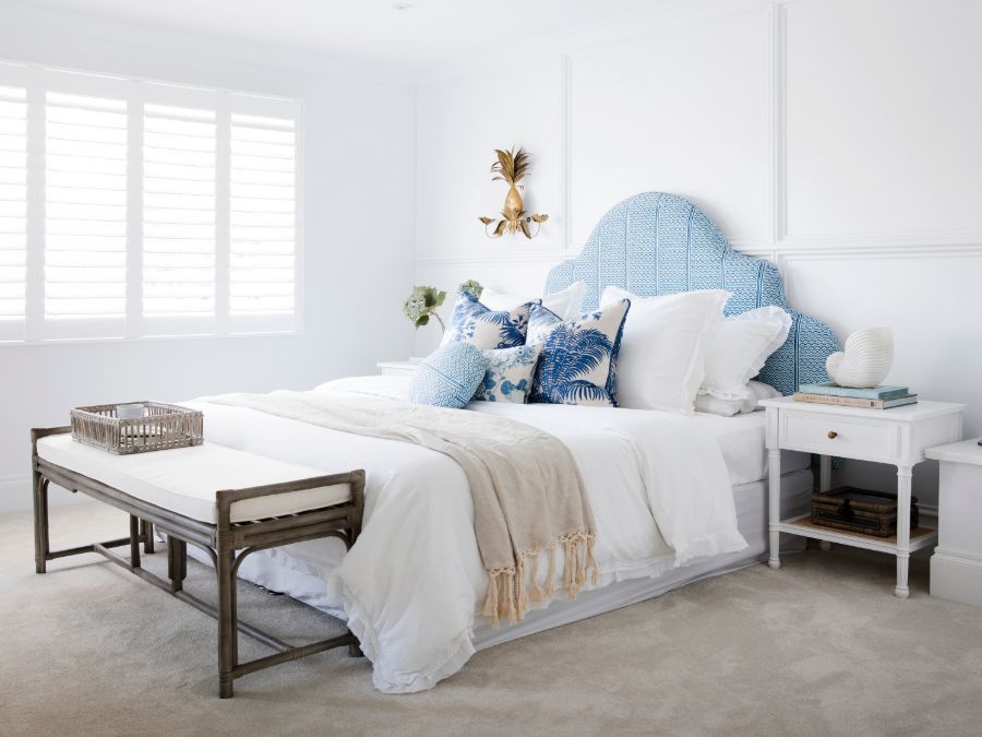
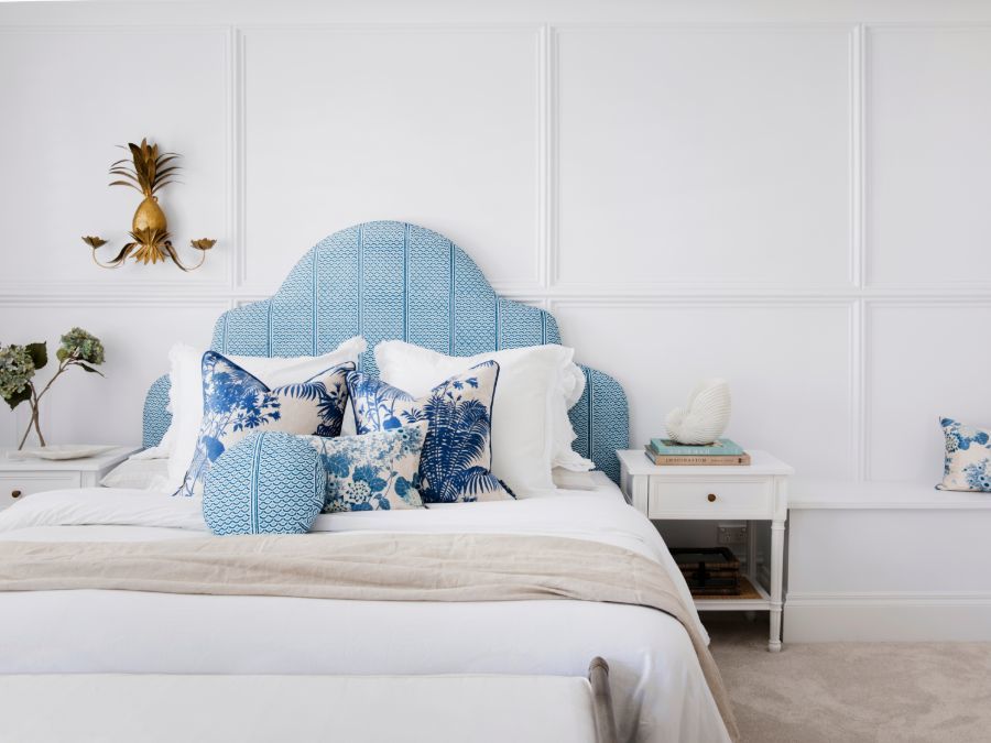
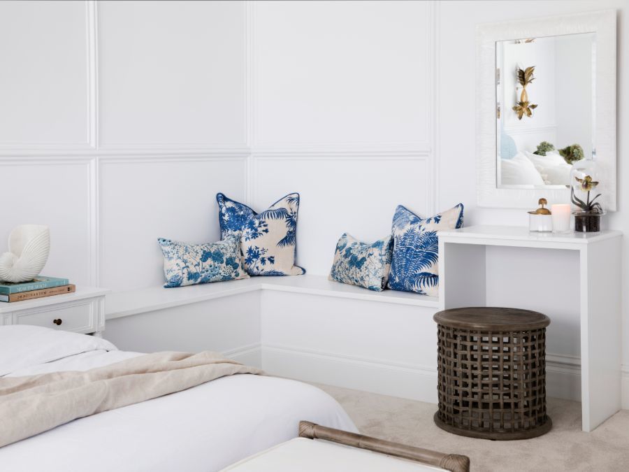
The final master suite is light-filled and welcoming. The unique headboard and throw pillows bring through pops of colour that directly represent the ‘Colour Me Hamptons’ theme of the home. The bench seat adds visual depth to the room, and quirky touches like the pineapple light fixture and shell curtain holder provide just the right amount of extra character.
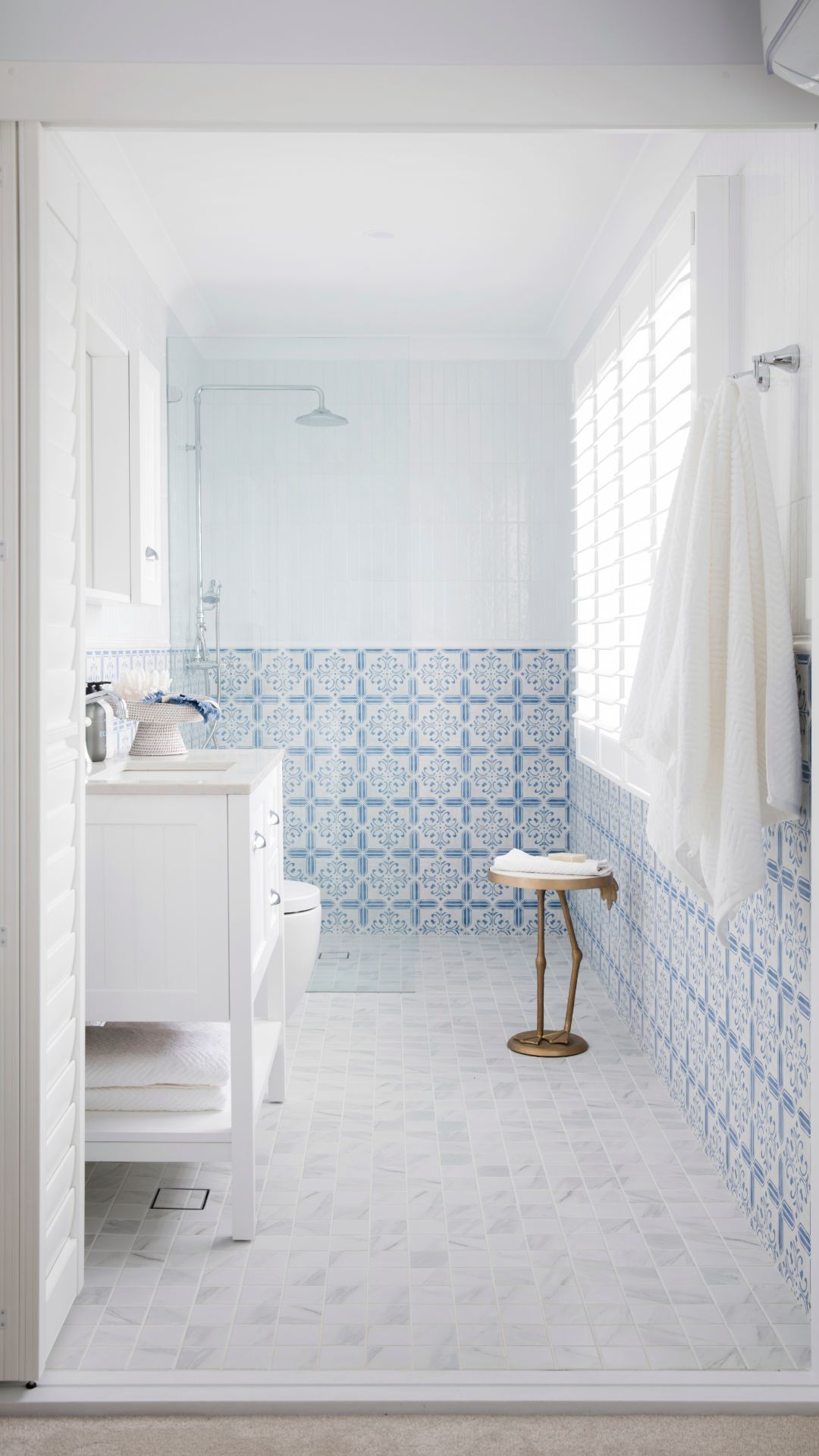
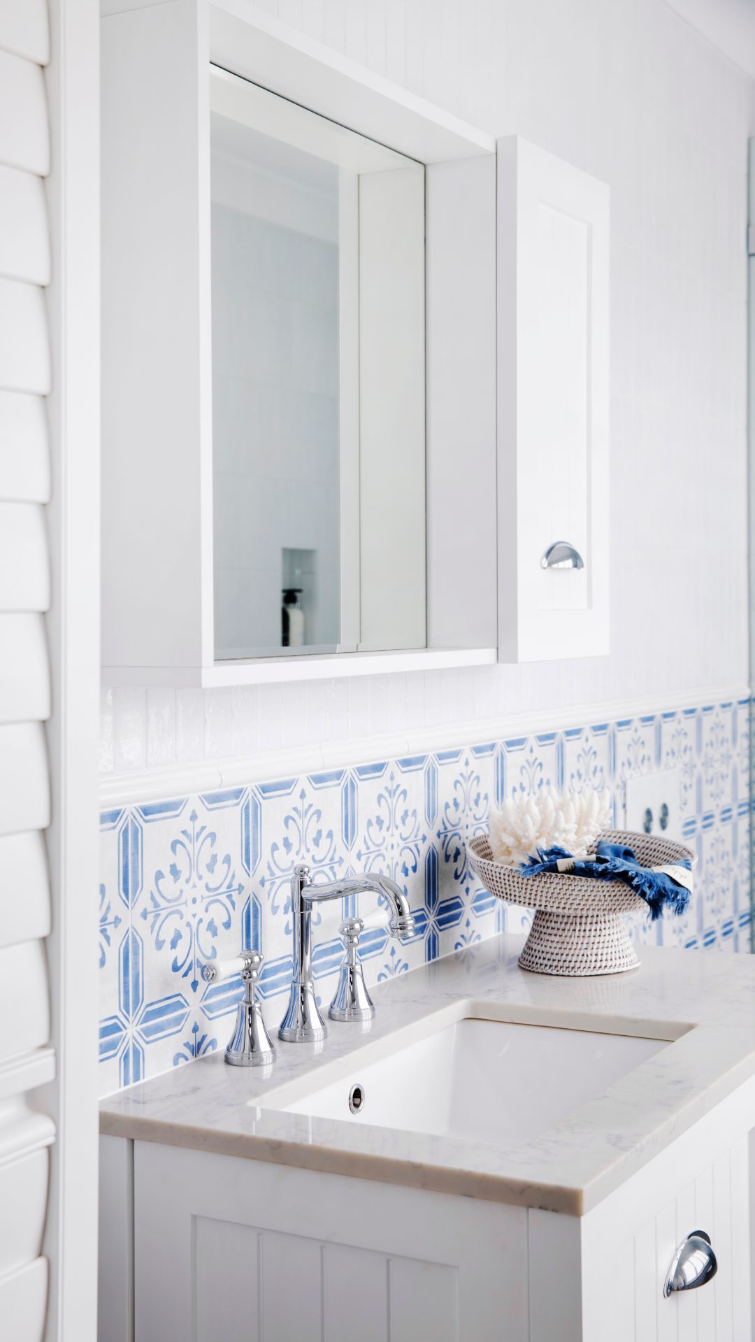
The white shutter opens up to reveal the glowing master ensuite. The traditional style of the Kado Era Wall Hung Vanity perfectly suits the Hamptons feel, with the chrome handles accented by the matching Kado Classic English Basin tap set. The blue highlights continue with the custom porcelain tiles, creating a seamless connection between the two rooms. The glass pane shower screen opens the entire space, adding extra depth without removing functionality, and the Kado Classic Telephone Style Shower completes the traditional feel, telling the story through every tapware element.
